/ packaging
It is common to think that a package design ends with the product being put on a store shelf. This is not true. This is just the beginning – the design becomes the first touch point between the brand and the customer. A superior package should keep a sense of expectations and encourage interactions. To achieve excellent performance, we need to understand the people. How they are going to use the product, and how we can unveil the brand narrative that is embedded in the design.

LAUGHING STOCK VINEYARDS
ROLE: CONCEPT CO-CREATION / LOGO DESIGN / GRAPHIC DESIGN LEAD / TYPESETTING / WEBSITE DESIGN
In the fall of 2004, Brandever invited me to collaborate on the design of a wine label for Laughing Stock Vineyards. Both owners decided to move from their methodical and calculated lives in the Financial Industry and follow their love for wine. We started with the de-construction of any tangible artifacts that are common on the trading floor to see if we could translate their language into a new application. The final label is constructed of information rings directly silkscreened onto the bottle that follows the idea of a ticker tape. Stock quotes listed on those rings reflect the state of the market on the day of harvest, and in time, the bottle becomes a 'time capsule' reflecting the new and past lives of the vineyard owners. We wanted the customer to pick up the bottle and turn in hands while reading and, by gaining the inside knowledge captured in the rings, become one step closer to purchasing the wine.
Laughing Stock wine label received many International Awards, including being the Finalist in London International Awards, where our label was selected from 16,686 entries from 79 countries, and the Applied Arts Design & Advertising Awards Winner (LFNG Blind Trust Red). Laughing Stock labels also won at The San Francisco International Wine Competition and a Gold Medal at Los Angeles International Wine & Spirit Competition.


The design process looks at motion, space, time and appearance. Not only our product needs to attract the eye of the customer, but it also evokes an emotional connection with the brand. Physical artifacts can trigger memories and, through association, enhance the perception beyond the idea of holding a bottle of wine in your hand. Everything is connected, and everything matters.
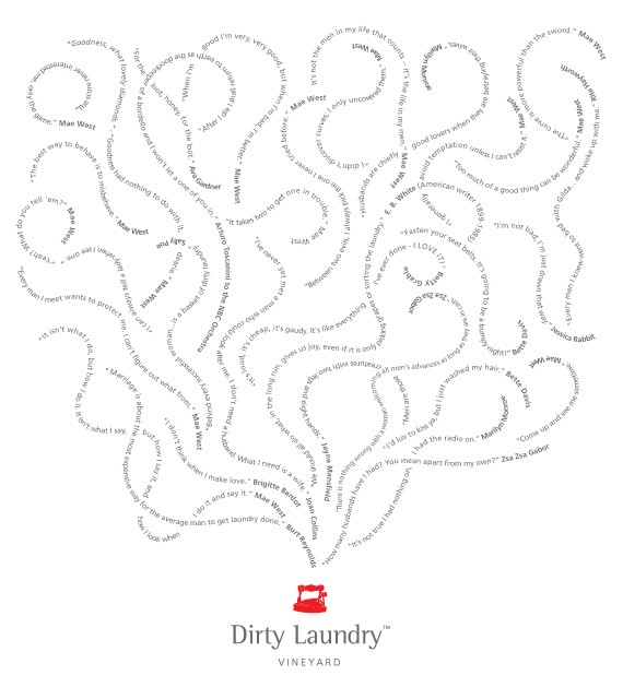
DIRTY LAUNDRY VINEYARDS
ROLE: CONCEPT CO-CREATION / LOGO DESIGN / GRAPHIC DESIGN LEAD / TYPESETTING / PHOTOGRAPHY
This project is a result of another successful collaboration with Brandever. Through his branding research, Bernie discovered a fantastic story about the building… back in the 1900s, a Chinese laundry was a storefront for a little bordello upstairs. Right from the beginning, we knew that this had huge design potential. We wanted something 'clean' looking but at the same time 'hot and steamy.' The final concept is based on duality - on one side, you have the clean lines of the 'laundry' element, and on the other side, the red and hot, old-fashioned iron forms the focal point of the brand. You need to pick up the bottle and hold it towards the light, and upon a closer inspection of the steam patterns, some curvaceous nudes can be uncovered. The light emboss encourages touching and stroking. Upon the release of the wine, the story was 'leaked' to the wine stores and salespeople with the idea to share the secret knowledge with customers… and the wine started to sell like crazy. I should also mention how much fun it was to photograph wine bottles in suggestive poses.
The label won numerous awards, including a spot in Communication Arts Design Annual 46 – apparently, it’s not easy to get there… Also, Dirty Laundry won awards at The San Francisco International Wine Competition and captured the Best Label Design medal at the 2005 Okanagan Fall Wine Festival.


We see we touch, and we play with objects that motivate us to interact with them. Only through careful research and a truly holistic view of the brand can a designer move from individual touch points towards cooperation of various brand elements supporting the desired customer experience and satisfaction. Every project offers opportunities to learn new things, meet new people and see the world from a different perspective, and, most important - build relationships.
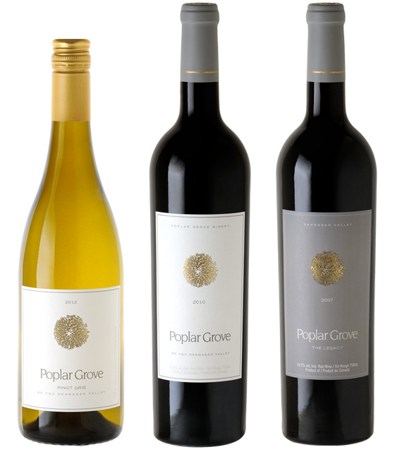
POPLAR GROVE WINERY
ROLE: CONCEPT CO-CREATION / LOGO DESIGN / GRAPHIC DESIGN LEAD / TYPESETTING / WEBSITE DESIGN
Poplar Grove is one of Canada’s most serious wine producers. I was invited in the Summer of 2007 by Brandever to work on the new wine label. Poplar is known for their luxurious, opulent, and highly collectible wines and the artwork needed to reflect the tradition, but at the same time, the owner wanted to show his multi-dimensional approach to wine production. Through our research and design analysis, we collected a large set of concepts featuring poplar trees, but none of them really worked for the team. The final idea for the Poplar Rosette came from the architectural representation of trees - the rosette is the top view of a tree forming an abstract crest which is modern looking, bringing a lot of traditional qualities to the brand.
Poplar Grove also invited us to come up with a website concept to feature their new wine labels. Instead of a typical winery web structure, we started by talking to wine journalists, sommeliers, and wine enthusiasts to find out what they think about Poplar. Those short conversations were videotaped by me and later edited to fit a web format. The website was based on a series of casual talks about wine. The new website was featured in the 2008 Applied Arts Interactive Annual, and it was selected by Communication Arts to be featured on February 26, 2008, on the CA website. In 2013 we re-designed the site again, and now it runs on the vin65 platform and, of course, is fully responsive.


